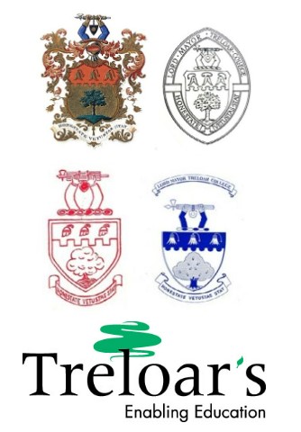
We have a little announcement to make this new year! Treloar's has undergone some changes in the past few months in order to become a brand that is more accessible.
How to make your brand accessible?
Together with our graphic designer, we have worked really hard to update Treloar's logo and brand assets so that they are legible and easy to read.
The logo
Sans-serif letters make it really legible and clean to read. The thickness of the letters help to make it bold and visible from a distance and at small sizes. The apostrophe is a leaf which is inspired by the tree, and the letter ‘a' is the type used in classrooms. The distance between the letters is also slightly wider, making it easier to read. These subtle details help to tailor the logo to our students.
The tree

This is our new tree. It’s follows on from a long line of oak trees that have appeared in the Treloar’s logos and crests over the past 100 years. This styling of this tree is inspired by the creativity and enthusiasm of the students at Treloar’s. It was created using a thick pen on paper before being rendered digitally and it has as light lean to the right giving it a subtle element of progress. Below is a snapshot of trees illustrations found in the Treloar’s archives.

The colours
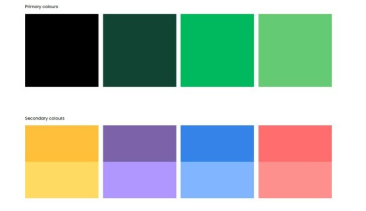
We have also introduced a new colour palette. Colour is a really important brand asset for several reasons. The primary colours are dominated by green which makes the brand iconic and easily recognisable; the secondary colours are vibrant and bring youthfulness and positive energy to all that we say and do. These colours have been carefully selected to work together as a set whilst also complying to the AAA accessibility standards.
The secondary palette is multi-colour and is split into bold and light shades. The lighter shades are for placing black text on as the contrast meets the AAA colour standards. The bold colours are there to work along side the light.

Colour accessibility
Colour accessibility is really important as Treloar’s has to clearly communicate with everyone. This means we need high contrast with our colours. WCAG (Web Content Accessibility Guidelines) are the leading authority on colour accessibility. Treloar’s conforms to their highest standards.
Fonts
Treloar's has introduced a set of new fonts. The fonts are modern, friendly and very legible.
Why is accessibility important?
Some may ask why accessibility is so important to, not only us, but also to others. The answer is simple: accessible branding and websites allow all users, including those with disabilities of various kinds, to access the same information and services that are accessible to people without a disability. There is a growing number of disabled people; as a consequence, it is crucial that we all have equal access to print and online content. As technology evolves, we all benefit from accessible design, whether we use the web through our smartphone, or voice assistants, screen readers or other accessibility tools.
What’s next?
Over the coming months you’ll start to see changes across our various digital and print publications including an improved website in the next year.

